Tuesday, November 01, 2005
Logo
I'm trying. I'm trying really hard.
Nothardenough.
I just don't like this logo!
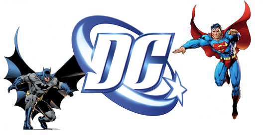
The more I see it on product outside of comics, the more ridiculous it looks to me. It's distracting me. The moment I saw it on the image to the right, my first and only thought was, "Wow! That would be so much cooler if it were the old logo."
The old logo is classic. It does nothing to impede. It only was there to enhance whatever it was placed on. It holds up well under less "comic-booky" conditions and well...it looks like it wouldn't have to be replaced once every five years.
I know DC won't bring it back but dang, how I already miss it on my box of Justice League Mac & Cheese.
Comments:
<< Home
And the old logo looked like the inscription on the bottom of a bullet. That was classic. How can you replace such imagery?

Just like all of DC's heroes that have died and come back, the old logo will eventually return (hopefully.)
When they first unveiled the new logo, I showed it to a design major friend of mine, who didn't really like comics. He said, "I think the change was a bad decision. The old one's iconic. The new one's not bad it's...just weak." Amen.
Glaser's design refined the logo they were using before into a real icon.
The new logo has LESS legible letters. And a stereotypically 90s swoosh. And an even more sterotypically 90s color gradient, thus ensuring it will look that much shittier in black & white. They reduced the number of stars from 4 to 1, anybody notice that?
This is a logo of the dot-com bubble era. Something that wows the execs in meeting room 1A, and makes them want to use phrases like "synergizing the core community," but fails on so many basic levels to actually BRAND. This thing stinks of middle managers justifying their jobs.
Marvel gets the job done with white letters in a red box. Letters you can READ.
# posted by  : 7:55 AM
: 7:55 AM
I don't know, I think this is a fine corporate logo for DG Comics...
Oh wait...
The moment I saw it, it looked like something from a bottle of washing-up liquid or a box of washing powder. It still does.
"DG Comics: Keeping your clothes bright and clean!"
Oh wait...
The moment I saw it, it looked like something from a bottle of washing-up liquid or a box of washing powder. It still does.
"DG Comics: Keeping your clothes bright and clean!"
The C is weird. Other than that it looks fine. It only looks out of place on the image above because the Batman and Superman next to it are goofily Jim Leeified, and whenever Jim Lee draws Batman or Superman, they just end up looking like WILDCats in Superfriends suits.
People freaked when the old logo was introduced, too. People freak when anything changes, for good or ill.
People freaked when the old logo was introduced, too. People freak when anything changes, for good or ill.
# posted by : 4:47 PM
: 4:47 PM
"Jim Leeified"?
Don't say stuff like that! I thought for a moment someone had created an unholy union of Jim Lee and Rob Liefeld!
Don't say stuff like that! I thought for a moment someone had created an unholy union of Jim Lee and Rob Liefeld!
Opposers of Innovation!
Atavistic Luddites!
Embrace the new logo ...
or suffer the consequences!!!!!
Okay-- it's not exactly what I would have hoped for either. But I do consider it an important over it's predecessor, which SHRIEKED "1976" every friggin' time I saw it.
Atavistic Luddites!
Embrace the new logo ...
or suffer the consequences!!!!!
Okay-- it's not exactly what I would have hoped for either. But I do consider it an important over it's predecessor, which SHRIEKED "1976" every friggin' time I saw it.
Don't say stuff like that! I thought for a moment someone had created an unholy union of Jim Lee and Rob Liefeld!
It will happen, mark my words. Right now the breeding pits of Hell are filled to overflowing with the debased spawn of Image artists. When the stars are right and the seventh seal is broke, forth shall walk the chosen one, the hell-beast, the Leefeld Incarnate! He will draw and plot a twelve-issue maxiseries involving the adventures of a single enormous swollen torso and its meaty cyborg leg sidekick. Chuck Austen will script.
Post a Comment
It will happen, mark my words. Right now the breeding pits of Hell are filled to overflowing with the debased spawn of Image artists. When the stars are right and the seventh seal is broke, forth shall walk the chosen one, the hell-beast, the Leefeld Incarnate! He will draw and plot a twelve-issue maxiseries involving the adventures of a single enormous swollen torso and its meaty cyborg leg sidekick. Chuck Austen will script.
# posted by : 4:45 PM
: 4:45 PM << Home