Wednesday, October 24, 2007
Kudos To...
JAMAL IGLE!
 I've been surprised. I like surprises.
Tomorrow's Teen Titans #52 is being drawn by one of my favorite artists, Jamal Igle.
I had NO idea.
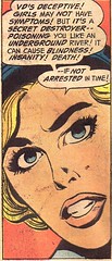
In the "House of Seven Hells!" this man's name on a cover is an easy sell.
Why?
Month in, month out, he's been delivering with quiet reliability.
There's no guessing with this man's artwork. His character's are "on-model." He renders a hand as a hand. His characters express themselves with their hands. A face expresses the writer's full intent. His characters occupy their own space and interact within each others.
Best of all, he's constantly looking for it, a new way to lay out a page, a new way torender a subtle something unique to the way character carries him or herself.
It's a certain something that can't be taught and Igle's art has it in abundance.
Over time, Jamal Igle's become an artist I've come to respect.
His art lets me know exactly what's going on on the page. His art makes me want to turn the page and go back and look at it again.
That's makes for a good comic and Igle does nothing but.
Labels: Kudos To...
Thursday, September 13, 2007
Kudos To....
THE SPLASH PAGE!
It's the first thing you'll see. It's there to make an impression.
When done right, nothing conveys more information than this, one of comics' greatest and oldest storytelling tools.
Recently, comics have been full of splash pages, unfortunately, in the wrong places. Lately, they've been used in the middle or end of a story to convey "epic scale" and often to the story's detriment.
Just my opinion, but too many splash pages, mid-comic, do nothing but confuse the storytelling. Personally, I've been conditioned to look for the splash (hook) at the beginning of a story and when it comes late, it throws me off a bit.
So, imagine my surprise when I noticed the splash page has made a major comeback. No better examples can be found than in two of this week's new releases:
THOR #3
 Why does it work? Artist Olivier Coipel's composition is absolutely beautiful. The "Welcome To New Orleans" sign in the foreground. Thor in the background gently descending towards the surface. Laura Martin's muted palette suggesting twilight.
It's brilliant, gently letting the reader in on the story about to be told.
Best thing about this splash page? The mud on the sign. It's a sad reminder of the city's abandonment. Two years after the flood, it's watermark still there, a reminder of the city's abandonment. It's a small, subtle thing but one that speaks volumes without one word being said.
WONDER GIRL #1
 Why does it work? Simplicity. Wonder Girl stands forefront and the first words you read are these:
"Her name is Cassandra Sandsmark. She is the second warrior to be Wonder Girl."
It establishes who she is and makes the reader want to turn the page to find out more about her story and the characters surrounding her.
Artist Sanford Greene, with his round line and Manga-esque influences, is nearly perfect for this character.
He establishes that this comic, featuring this young girl, might be something a young Manga fan might appreciate.
So, yeah, KUDOS to the SPLASH PAGE... and to those who truly know how to use it.
Labels: Kudos To...